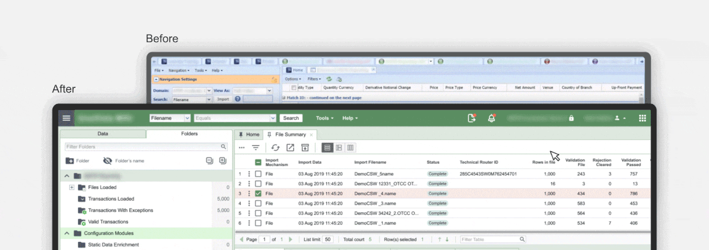
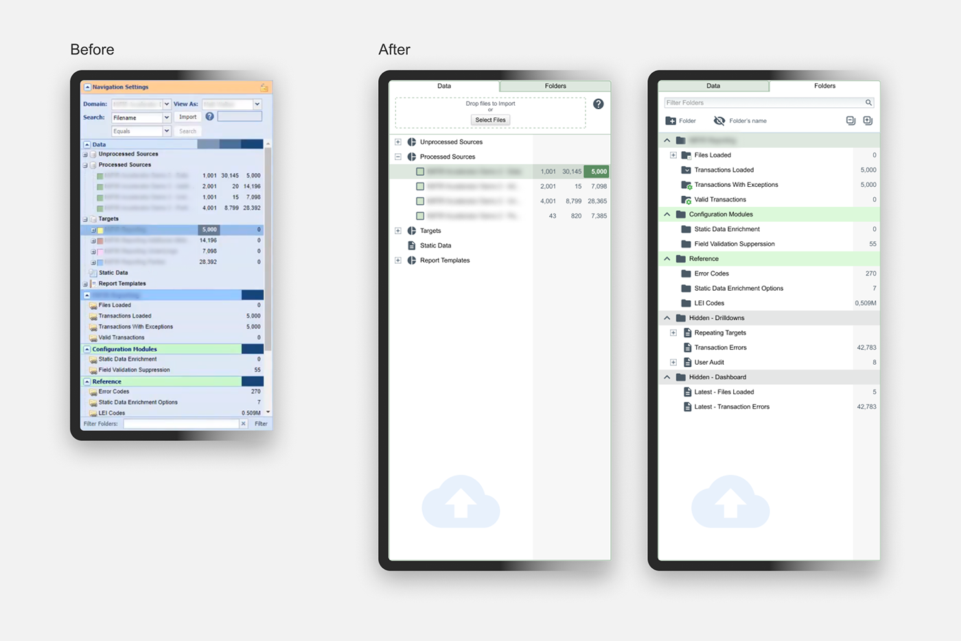
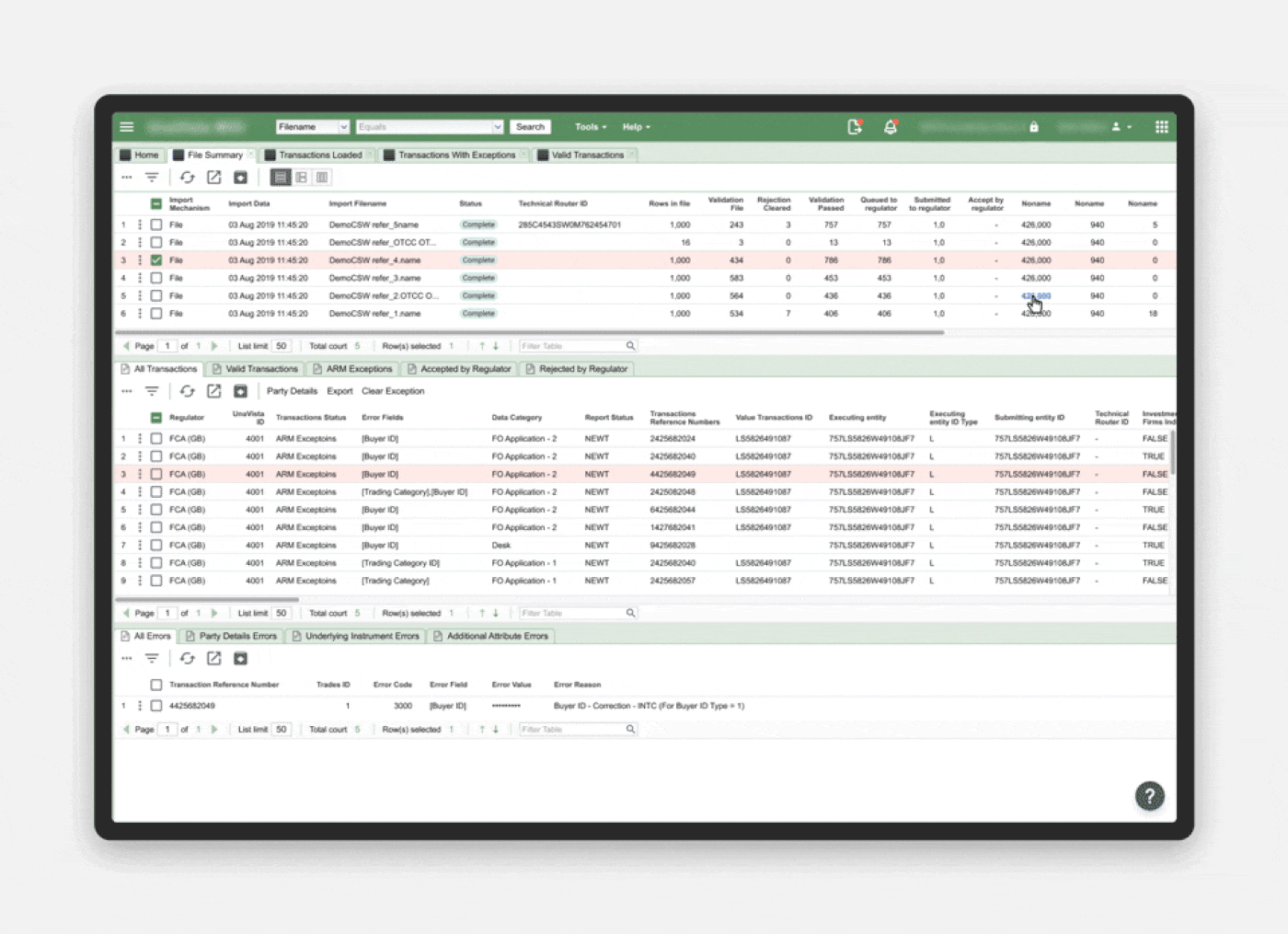
Stock Exchange Platform usability improving

Created
2019
Customer
Stock Exchange company (NDA)
Challenge

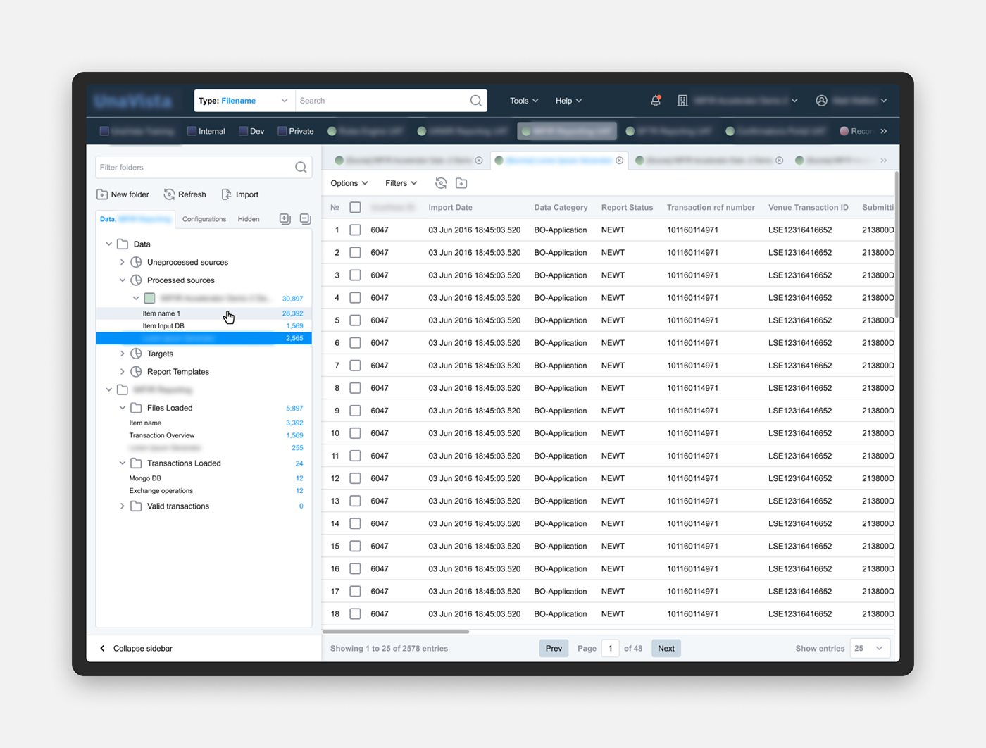
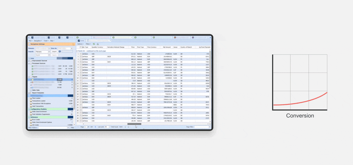
The customer has a platform for everyone associated with a stock exchange: banks, brokers, investment companies, buyers and sellers. With the help of the platform, they solve their work tasks every day. The system contains a huge amount of data and ways to manage this data, which makes the interface cumbersome and very difficult to understand, especially for new users. The customer asked us to improve the usability of the platform. At the same time, the customer refused to provide access to the system and we only had screenshots of the interface from zoom conferences.

Improvements
Header
We moved the main menu to the header, removed the most frequently used functions from the drop-down lists (file search, switching users and domains). We also moved the notification indicator from the footer to the header and made it more familiar and compact.
As a result, the number of steps for using the most frequent functions has been reduced by 3 times.
Left-hand pane
This is a place where the users work with data catalogs. We noticed that all the scenarios of interaction with this pane are divided into 2 main streams, so we divided them into separate tabs. We also improved navigation, moved important tools from the context menu to the left-hand pane and added the ability to collapse-expand the entire pane for more convenient work with tables.
As a result, users are able to easily find the main functions of the left-hand pane without a guide document.
Tables
For tables we added different views and also placed important functions to the toolbar. Together with the ability to hide the panel, users received a tool for flexible and quick customization of tables, which makes it convenient to work with any data.
Additional suggestions
We also offered a version of an interactive guide on the interface directly in the application itself. Now the guide exists only as a separate pdf document. Additionally, a new ui-kit was proposed with improved compatibility and modern styling.

Unfortunately, these improvements have not been implemented.
Result
We have shown how even quick interface changes without a global redesign can largely improve the user experience. The speed of working with the modified sections of the platform has doubled.

Next project

Medical Equipment Management System

Conducted a UX audit of the interface components with an assessment of the temporal and cognitive losses of the user during interaction, proposed options for improvements.

plan for + 85% interface improvements

Order

(doc, docx, pdf, jpg, jpeg, png, txt. Max size is 10 mb)